I'm redoing my living room.
I'm redoing my living room.
I'm redoing my living room.......
Have I mentioned that I am redoing my living room?????
I am driving myself crazy with this $%&!!!!!
You think it's hard decorating your own house????
Try doing it when you can design your own fabrics,
and then change the colorways to be
anything you want.....
I have finally settled on the pattern I am going to use.
It's from my Fall 2016 collection.
(don't you just love how that sounds?)
(It's like I have a gazillion different collections.)
(when we all know I have the grand number of....one...)
Josh (the boy wonder who is my partner and pain in my @$$) didn't want to sell this pattern in the large 18" repeat size.
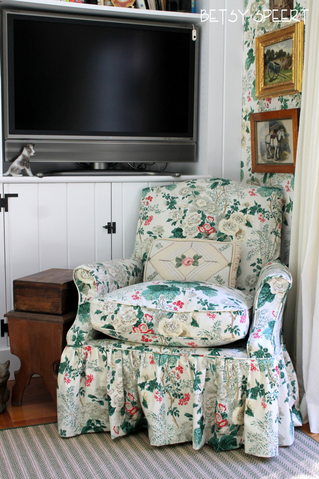
Now that he sees how it looks on chairs he has changed his mind.
WHY DOESN'T HE EVER LISTEN TO ME?????
It's called Gypsy Bouquet.
Why I called it that, I have no idea.
Don't ask me to explain myself.
You'd be waiting for an explanation a looooog time.
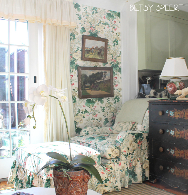
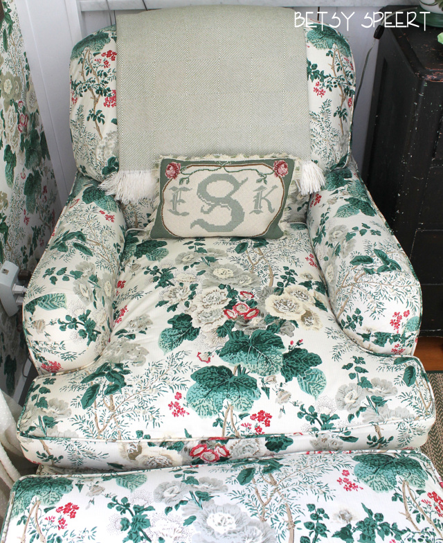
I have pinned the fabrics over my new antique chair and on top of my draperies, so I could see how they will look.

It lays out just perfectly for the back of a French Chair, or a toss pillow.
The reason for this is because
THAT'S THE WAY I DESIGNED IT.
I am soooo fabulous.......
Due to pressure from my besty Kris and Josh, I am using this sophisticated colorway for my living room.
I think it is the prettiest one.
The muted pink one matches my carpet, but this one is more growed up.
And I am a growed up person.
I am selling this in 2 scales.
This large one, which will be available in the Spring of 2017, and the smaller scale is available now.
Unless you want to order the larger scale, and then we can talk!!!!!

I was thinking about having the walls repainted in a soft green to offset the white background of the drapery fabric, but Josh thinks the white will look nice and fresh.

What to do.... What to do.......
I stand in the doorway of the living room and just stare and wonder...
stare and wonder.
I got sidetracked onto a tangent of pink color by my muted pink colorway that isn't even in my collection.
(Josh vetoed it, it's printed on my natural line background, but not the white linen like here.)
The pink in my collection is a brighter color that he says is more the look of today.
I'm not sure.....
but there seems to be an insult in there somewhere......

See how it lays out great on a pillow?????
(I pinned it over my old pillow)
I am da bomb!!!!!
I was considering this with the smaller scale for the draperies.

It's very pretty with the pink rug in this room.
But Josh isn't going for it, and this will be an ad.
Or a magazine story.
Or both?!?!
I think this is a quintessential cottage look for a cabbage rose in pink.

See how it goes with my rug and the way the bookcase is painted now???

I will have to repaint the outside of the bookcase if I use the cream and green fabric.
Which I am going to do.
I think.
No, I'm sure.
Maybe......
I thought the problem I was having was that I needed a more sophisticated pink.
SO.....
I recolored the pattern in a more monochromatic pink colorway just for me me me.

It went OK with the rug....

I can never tell how a fabric will look in real life.
It always prints differently than on my computer.
Sooooooo...
I worked up 5 different levels of color.
That's 5
5!!!!
5!!!!!

I must admit to the class that the lightest one looks SUCKY!!!
So
after all that time fiddling around with pinks....
I am back using the cream and green.

Unless I change my mind.
Or design a fabric I like better.
In the mean time,
I have designed an awning stripe for my two club chairs to go with this and have recolored my Small Diamond Batik pattern in this colorway for my sofa.
I'll let you know when I get the strike offs from my factory.
By then I will have changed my mind.
Again.
Oy Vey.
On that note,
Latah, Gatah