Today I am refreshed, renewed, revived,
but mainly, I am
RELIEVED!!!!!
Thanks to Sarah for fixing my feedburner issue!!!!!!
Now.....
Back to my Florida kitchen...................
This is where I am now!!!!!!!
This is what it looked like when I first viewed the house with the real estate agent (those bar stools belong to the previous owners. OY!)
As I told you, when showing off my living room.....
......................but the wall cuts off the view of the kitchen.
THIS IS THE STORY OF HOW I GOT FROM
THERE TO HERE!!!!!
First to be changed, as I mentioned numerous times: Close the hole, and extend the wall!!!!!
(and wall paper anything that wasn't moving!)
The next thing I tackled was changing the doors and drawers.
The original cabinets had partial overlay doors.
Those are doors that overlap the frame of the cabinet, but still show part of the frame.
I don't like that look. I don't like that look.
I don't like that look!!!!!
give me either a full overlay
(where the doors cover the whole front of the cabinet.)
Or
an inset flush door
(where the doors are set inside the frame of the cabinet.)
Sooooooooooooooo..........
Keeping the idea of being fiscally prudent (HA!)
I just changed the cabinet doors and drawers to a full overlay.
I drew the doors I wanted, and had the cabinet maker make em!!!
I found some 1940's looking hardware at Restoration Hardware.
I love me a funky pull!!!!!
Here's a full overlay door and drawer.....
Soooooooooooo..........
Then I added a header and crown detail to the top of the cabinets.
DON'T JUST ADD A CROWN!!!!!
NO NO NO NO NO!!!!!
Add a board, a half round, and THEN the crown molding.
LIKE THIS!!!!!
It just looks a lot gooder!!!!!
Rather than just having a crown molding stuck on top.
It's relatively easy to add. (HA!)
No really, it is.
The half round molding covers the crack between the two inch board and the top of the cabinet.
To deal with the empty space where the pass-through hole had been
(over the sink)
I designed a plate rack......
I am SOOOO CLEVER TO ADD THE MAGNETIC STRIP
FOR A KNIFE RACK!!!!
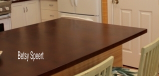
Then I had the countertop changed to a dark stained mahogany to match the dark furniture in the dining area.
I feel it gives it more of a West Indies vibe.
(The dark wood furniture, not the countertop!)
Then I made a BIG mistake, blunder, boo boo, #$%up.
I chose a tile that I loved, but looked
HORRIBLE
when installed.
SEE????
It looks really BAD
Way too busy, and way too dark!!!!!!!!!!!!!!
So then this happened!!!!!!!!!!
I lived with it for three years.
Girded my loins.
And had the @#$ stuff removed!!!!!!!!!!!!!!
YAY!!!!!!!!!!!!!!
I'm going to stop my story here, and pick up at the same point
NEXT TIME!!!
See ya later, alligator!!!!
Linking to:




.JPG)












.jpg)
.jpg)
.jpg)


54 comments:
That's right Betsy; tease us some more ;)
Yeah...that a girl! I have been neglecting my work all day ....just to check in to see if you posted. It was so worth it. I have to know more about your wood counters....... do you recommend them or regret them?
Love reading your blog. You are too funny. Its comforting somehow to hear that you too have made a blunder in your choices. The new look is quite a departure from the original. I like the dark counters.
Love the way your kitchen looks with the glass doors and the dark wood counters.
Your kitchen looks great! Do you know how many tile blunders I'm on?
Count 'em. 3! I finally got it right. Simple white subway tile. Hello?
Why didn't I do that from the start!? You're blog is great, and I love your humor!
You have so many good ideas -- love the plate rack over the sink. I hope you show your kitchen floor -- is it the same as the living/dining?
Oh Betsey, this is my new go to comment:
"I lived with it for three years.
Girded my loins."
@#$% Genius!!!
Walling up that pass thru and extending the wall was brilliant!..I am with ya on the tiles...looks great when it is "stand alone", but putting it all together on the wall..yeah, a tad busy and dark...
You turned your kitchen into to a masterpiece..again..beautiful!...Yes, I am now getting my emails of your posts.
I, too, want to know about your stained wood countertops, Betsy. Cook much? I'd be living with a furniture marker in my hand at all times, because that beautiful wood would be ALL scratched up! Oy!
Betsy your kitchen is so beautiful! The plate rack was such a creative solution. I adore your oven... please share with us the manufacturer!
What you have done is fantastic !
Betsy, can you also tell us where you go the bamboo wallpaper, please? Is it textured? And, the source on your tile backsplash in the kitchen too? Many thanks.
It looks like you have a down vent on your range as well as on overhead vent. Do you find that two vents are necessary to prevent odor/fumes from reaching rest of house?
All your changes and renovations in your kitchen are beautiful!! I LOVE everything, especially how you closed up the one wall.
Mary Alice
Looks wonderful! The colors are amazing, can't wait to see the rest!
Laurel at SoPo Cottage
Thanks for sharing. I love your kitchen!!!! I am a new linky follower and can't wait to read about the rest of the remodel!
Really like that you closed the wall up, and added glass to your doors, what a difference. Love the plate rack you put by where the open wall was, and the crown molding! Really nice remodel. Thanks for sharing your creative inspiration at Sunday's Best.
Wow, what a major difference. It's just beautiful.
Wow, that's a great transformation! I love that you extended the wall and filled in the pass through. I probably would have been too wimpy to do that, but it turned out really well. Too bad about the tile... having lived with really busy tile (in the bathroom as well as the kitchen!) I fully understand what you went through! I think the plate rack is my favorite though!
You are so hilarious and real! The plate rack over the sink was genius.
Gorgeous! The colors are perfect!
You took your kitchen from invisible to totaly rocking. But you don't need me to tell you that. Bravo!
Love your kitchen! Love the style! Wonderful redo! (That little Viking is so cute!)
Just went and looked at the Before - and I am amazed what you did with some headers, crown molding, and new cabinet doors. Oh yes - the counter and appliances and gorgeous backsplash too. Love it!
Love your makeover of your kitchen. Had to chuckle the way you explained it.
I am visiting from The Delectable Home
:) jeanetteann
Betsy, you are truly a GENIUS!!! I love all of the detail, the plate rack, the magnetic strip, the lovely light green tile, the heightened look to the cabinets and everything else, it's GORGEOUS!
Hugs, Cindy
Very nice looking kitchen you have..
Wowzers!! What an awesome kitchen transformation! I would love for you to link up at may party going on now at Jillify It! Hope to see you there!
Jill
www.jillifyit.com
What a wonderful renovation. Looks like a breath of 1940's fresh air! Just beautiful!
I love the glass cabinet doors and the dish collections displayed. It's so pretty! Thank you for linking this up at the "Cowgirl Up!" linky party. I appreciate your participation♥
Linsey
Betsy, thanks for showing your beautiful kitchen at my party. I like your posts because you are so honest to reveal your mistakes. That makes me feel ok about some big ones I've made. One of my favorite things in your kitchen is the cute little green clock. I look forward to your next post to see what you are tearing down or putting up as you continue giving your home a cozy tropical look and feel. Take care. ------------- Shannon
Wow what a great look. The kitchen looks wonderful. Love the counter, the bar stools. Love the dishes too.
blessings,
Debbie
Love the dishes in the kitchen and your tileon the backsplash is beautiful what a fantastc redo!
It looks wonderful! Thank you for sharing at Potpourri Friday! I always appreciate your participation!
You are one handy lady! I love the tutorial on crown moulding. Can't wait to see the rest of the story. I'm your newest follower so I can come back often.
I love this kitchen! This is such a beautiful transformation. I agree that dark wood gives a west indie kinda vibe. I'm going for that look in my master bedroom. The plate rack really stands out and I love the hardware you chose. Thanks for sharing this delicious kitchen at my Show & Tell party!
Sharon @ mrs. hines class
LOVE the new kitchen! All the way from the cabinet doors to the moulding (thanks for the tip) to the dark countertops! I can't wait to here the story of your new subway tile. Thanks for linking up!
Love the color you chose, and the counter is STUNNING! I'm your newest follower, I'd love if you followed in return and linked up to my little party: http://www.nutmegplace.com/2012/03/showoff-saturday-5.html
Hope to see you there!
Beautiful!
... great work :)
Greetings from Australia♥
I featured your adorable kitchen today on Mod Mix Monday!
Hi Betsy! Your kitchen is FABULOUS! We wanted to let you know we will be featuring it this week at Inspiration Friday. Thank you so much for sharing it with us!
Heather
Love your kitchen! The wallpaper is amazing. Good call on that busy tile. Too Mexican and didn't quite go with the vibe ...
And who is the miracle worker Sarah? My feedburner feed is messed up and not sure who to turn to for help ...
:)
Linda
Your kitchen is gorgeous! I fixed up my kitchen lats year but always looking for new ways to continue to freshen it...love your color choices hard ward...well all of it! (My feedburner was all messed up too! What gives!)
What a wonderful kitchen and such a vast improvement from before! Thanks for linking up to the RRR Transformation party -we just shared this on our FB page.
Whitney-The Rooster and The Hen
amazing transformation!!
all i can say this kitchen renovation done very great and look wonderful.
We had the same kind of hassle when we moved into our place, well we chose all the tiles, fitted them and then had to take them all up to replace all the (very old school wiring) using some super skilled Bedford electricians.
Hi there,
I love the crown molding detail you came up with. . . would you mind sharing a section drawing of how the whole thing gets attached? I am in the process of designing my kitchen with full overlay cabs but I always hate the way they wrap crown molding around the box and face frame and not taking into account the thickness of the door!
Also, where's the tile from?
Best,
Gregory in Philly
wow...nice work and wonderful ideas....love the glass doors!!!
Great work done with creative ideas. It prove useful for all those who are planning to rennovate. looking wonderful.
Hi!Awesome post.Nice ideas and great work shared through this post.I simply love the glass doors.All i can say that the kitchen renovation work done is fabulous and looks wonderful. Cheers!
I just cannot get enough of that subway tile look. Thanks for all of the pics - I get so many great ideas from reading your blog please keep it up!!
Great looking kitchen! I've been browsing the internet for inspiration and ideas to start my own kitchen remodel. I already have my table picked out and I plan to go look at double oven range tomorrow. What is the most durable and cost-effective counter top material, in your opinion?
To be honest i am really impress in your kitchen design in fact i am looking for some kitchen design for my kitchen renovation and this one is inspired me and create an idea on my mind .Thanks.
Post a Comment