
Well.....................
I'm still up in Massachusetts.......
Now don't get me wrong.......
I love my family.....
I really, really, really do!!!!!
It's just a little cold.
And there's white stuff on the ground.
Now I know I've always said that I like stuff.....
but I don't like this white stuff!!!!!
NO NO NO NO NO!!!!!
Sooooo.....
To make us all feel better.....
let's look some more at my buddy Connie's Florida beach home.
On Saturday I was milking the story telling you all about
her living room.....
SO LET'S CONTINUE!!!!!

The cottage has an open floor plan,
with the living room, dining room, entry and kitchen all together.
There is a hutch in the dining area that backs up to the kitchen that
TPD (the previous designer) had sold to Connie and Chris.
Here's a shot of how it used to look.....

This was just after Connie had moved into the house, and we had started looking for accessories to goose it up.
I felt it wasn't tall enough for the space, so I found stuff to put on top of it,
to raise your eye, and give it a better scale.
I mean.....
TPD had these wonderful tall ceilings.....
and she chose a short little hutch?????!!!!!
OY OY OY OY OY!!!!!
I know lots of you guys love the distressed look.
But I felt that this piece looked too fake.
I only like realistic looking distressing.
My technical description of the finish above is: Sucky!!!!
I particularly disliked the stained finish on the serving top.
soooooooooo...........
I had Chris prime it in white, to prepare it for a better paint job.....
(he's not the biggest dIYer, but he was a trouper....)
and I loved the look of the simple primer!!!!!
So I says to Connies, says I....
"Let's leave it just like this!!!!!"
and being one to go for the cheapest, least expensive, lowest price,
easiest way to do something (not) she said "OK"!!!!!
Now it really looks oldish and beat upish.....
(yes, I'm making up my own words.....)
(It's my blog, I can do whatever the @#$ I want!!!!)
Here's the way it used to look on the wall.....
before the wallpaper was added and it was painted white.

Here's how it looked after.....

It's graphically stronger, crisper, more of a pop.....
When you choose furniture, think of how it relates to the wall it's going against, how it relates to the colors in the room....
See how the white refers back to the white upholstery?????
It's almost as if a designer was involved!!!!!
Then when you're arranging the stuff inside the hutch,
again....
think of how it will stand out against the background, the shapes and colors.
Sooooooo.....
TPD really chose a beauty here.....
There isn't enough distance between the lower shelves for a dinner plate to stand up.
Now this is OK if you want to display your tea cups and saucers.....
BUT IF YOU WANT THIS FOR A PRACTICAL PURPOSE.....
IT DOESN'T WORK!!!!!
So.....
when life gives you lemons.....
what do you do?????
you shop on ebay!!!!!!!
Connie had me look for a collection of pottery that would reflect the coral color of the kitchen and living room accents.
So I went trolling for ceramic seashells which
I mixed it in with the real thing.

I found Catalina and Poole pottery from California and England.


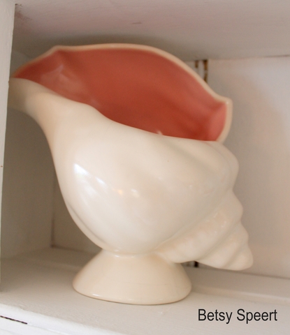
I was pretty psyched about finding these pieces with the coral color....
I mean.....
WHO KNEW THIS STUFF WAS OUT THERE?????
LET'S HEAR IT FOR ebay!!!!!
Now, while I'm trashing TPD.....
Notice where the switches are to the left of the hutch?????
I had them moved there.....
She originally had them on the wall
behind the hutch.....
HOW THE HELL WHERE YOU SUPPOSED TO TURN ON THE LIGHTS?????
I really wasn't initially crazy about this cupboard.
The columns on each side didn't make any sense.....
I mean.....
THEY WEREN'T HOLDING ANYTHING UP!!!!!
WHY THE #$% WERE THEY THERE?????
So Connie and I added these iron sea shells as embellishments.
.jpg)
Now they make sense!!!!!
OK, that's all my complaining about this piece of furniture.
On Thursday I'll complain about something else.....
Later, Gator


.jpg)
.jpg)
.jpg)


13 comments:
I love the white too, and the way the coral works with the coral in the kitchen and the dining chairs... It's a yummy visual delight now!
Cindy
What Cindy said...
Nicole
I LOVE the coral pottery with the white, gorgeous!
I like the white better, but not the shells. They don't appeal at all. I'd have taken out a shelf, re-arranged the others, and had her buy dishes to match the colors in the room. But, since open shelves attract dust etc, you have shown me I need cabinets with doors, lest I end up washing the decor periodically. Now I hope you'll tell us how that woman gets along with the two light fixtures I see. Surely there are more? And where does she plug in that white lamp. Your suggestions on how to hide wiring will be so helpful. Thanks for being who you are, I enjoy reading your writing. You have helped me see my house in a new and elegant way. So much to do to make it more better. But I'm not complaining. You make it fun. Thanks so much.
Hi Betsy I just started following your Blog. You are a riot!!. Love the attitude! I too live in Massachusetts and have a home in Florida. I can't wait to get down there full time for the winter. Had enough of these New England winters .I agree with you about all the new distressed looking furniture, it does look fake. Love what you did with the hutch. I'm bringing mine to the house in Florida and am going to paint it white.
The hutch is so much nicer in white. But now I'm wondering...Were the dishes on the hutch really in use? If so, now where are they? I mean the shells and pottery are fantastic...just wondering where the dishes are ;-) (Stored below maybe?)
I gotta tell ya, this really made a big difference in this space...the white cupboard and the shells really warm up the place, add interest, and for the first time the kitchen cabinets look marvelous. The wallpaper was ingenious and the green shell plates on the top shelf add so much life!!! Good job girls!!!
What a miracle you worked on that hutch. It's so much prettier in white WITHOUT all that distressing. You've made it a show piece with all the accessories. Your vision amazes me but that's why you're a designer.
As I told ya, I volunteer to mail the TH spread to TPD so she can learn something constructive. I feel it would be a public service. Cheers! Beth C.
Hello Betsy, I feel I am ready to finally comment since this is the third night in a row that I am still up reading your blog at 2 am in the morning !! I guess you would say OY Oy Oy!!! :)
I am in awe of your talent and exquisite eye for GOOD design, your blog has delighted me no end since I found it but most of all I fell in love with you the funny, witty, warm and freely sharing person that you are. THANK YOU for sharing with us your talent and thank you for that refreshing ATTITUDE!!
I will be visiting often for sure, keep warm and post some more :)
Virtual hugs (oh actually I'll stop that, you're American and I am sure you don't do any &%S@ hugs)
Monica :)
All the furniture pieces look amazing!! I so prefer the hutch in white, with the shell pink just popping.
I'll bet you REALLY wish you were in Florida now. Or did you make it out before Armageddon?
You got to love Ebay!!
Post a Comment