Thursday, January 31, 2013

Beach Cottage in Florida

Last post I showed you guys my buddy Connie's house from the outside....
NOW
I'm going to start showing off the inside.
This house was published in Traditional Home in March 2007, so it's not as old as a lot of my other magazine stories.....
although Chris and Connie are old!!!!!
Sooooo.....
Some of these pictures, I took.....
and some are scanned from the magazine article.....
I will be sure to let you know which is which is which is which.......

As you enter through the front door, you step into the entry way!!!!!
That's 'cuz that's where you enter!!!!!
Traditonal Home March 2007
(This shot is on the cover of my color and pattern book....)
I love the look of crisp white against color.
Originally, the walls weren't wallpapered.
If you've been following my blog for a while,
 you may recognize this paper as the same bamboo I have on the walls in my Flerida home.
I will come back to the entry, 
but right now I want to take you into the living area.....

I took over this job from a local decorator.
At the time I didn't have a home in Florida,
and Connie thought it would be easier to use someone local.....
(bwa ha ha ha ha ha ha!!!!!)
Soooooo......
the original plan with the original decorator was to have painted walls.
But after I took over, and we had installed all the furniture....
Connie said to me.....
"The house isn't cozy, how can we make it cozier?????"
Where upon, I answered.....
"Do you want to know what I would do if I lived here???
I would wallpaper everything that isn't moving!!!!!!
Here's a shot before the wallpaper.....
There also wasn't enough stuff on the walls for me.
Connie was trying for a cleaner crisper look.
That's all well and good.....
but it's not cozy!!!!!
So I found more stuff for the walls for her.
And added wallpaper.....
And more pillows.....
Connie's favorite color is coral, 
so that is the predominant punch in the main living/dining/kitchen areas.
The previous designer had chosen the pink color of the kitchen cabinets, so I used that as the jumping off point for the rest of the room.

I was able to salvage some of the furniture from the previous designer....
The white sofa, club chair and two woven seagrass chairs were left pretty much as she had ordered them.....
BUT EVERYTHING ELSE HAD TO BE CHANGED OR REPAINTED OR MOVED TO A DIFFERENT PLACE IN THE FLOORPLAN!!!!!
Below is a shot going towards the kitchen, without the wallpaper, and the hutch painted in an old yellowy color.
This shot shows the room after the wallpaper and changing the hutch color.
Now let me break the room down for you in bit by bit by bits.
I had decorated Chris and Connie's Vermont home in a classic American cottage style,
but Connie wanted a cleaner slightly more modern feel for her Florida house.
We started with a more streamlined look for the main upholstery pieces.
Having an exposed leg helps to give the sofa a more modern edge.
Then I chose the contemporary classic gourd shapes for the lamps...
These shapes are a wonderful way to bridge traditional and modern.

We also used more contemporary art on the walls than I had used in Vermont.
I will do a whole post showing the art and how we chose it, and how we hung it, 
but not today!!!!!
Today was just a taste of things to come.
It's nice to look at a house in warm Flerida,
since I'm stuck up here in Massachusetts.....

Later, Gator
Photobucket

Monday, January 28, 2013

Warm Weather Dreaming.....

Even though I'm stuck up here in Massachusetts, 
and it's snowing
right now, this very minute, where I am.......
I thought I would show you guys the house that brought me down to Flerida.
My buddy, Connie, used to be my client.....
She figures if she moves, she'll be my client again.....
Let's hope she stays where she is.....
('cuz I'm lazy.....)
Anyway,
I was working on her house on the beach
(very often referred to as a beach house.....)
when I got it into my head, that I could have a home in Flerida too!!!!!
Soooooo.....
She's a big reason that I live down there in the cold months.
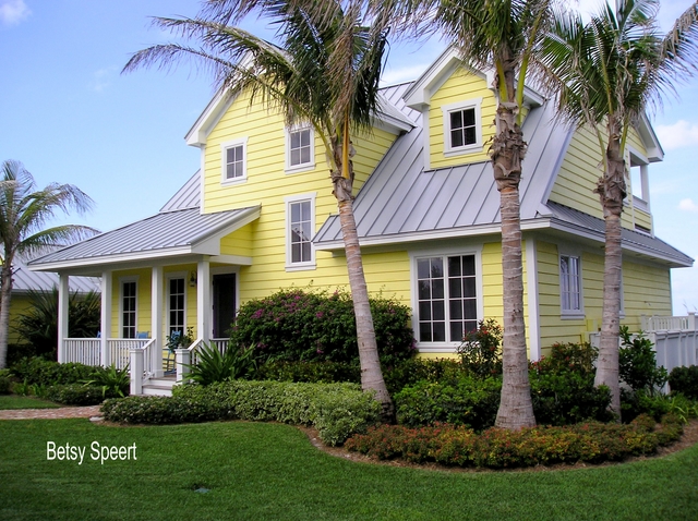
She and her husband Chris had bought a pink stucco shack on the water,
in order to get their hands on the land.
They took down the existing house, and built this cute little cottage.....
Traditional Home March 2007

We played around with the color, and arrived at this cheerful yellow.
Connie wanted a strong color for the front door, so I chose this
 
screamin' purple.....
It's hard to see behind the porch post.....
Then I added insult to injury by having the rockers painted Caribbean blue...
As you walk around the side of the house, towards the back.....
you pass the outdoor shower, 
which you can see part of to the left of this shot....
It's a combination garbage can shed/shower booth!!!!!!
Tres chic!!!!!
Straight ahead is the ocean, just over the dune.

Following the path all the way back, brings you to the deck overlooking the ocean.
Since I took this picture, in 2006, we've tweaked the deck.
HOWEVER!!!!!
Because I'm in Massachusetts.....
I can't run over to her house and reshoot some of these shots.....
When I get back to Flerida, I'll do that for you guys....
'cuz that's the type of conscientious and considerate blogger that I is!!!!!!!
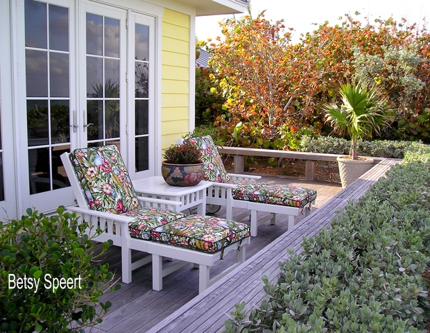
Down at the other end of the deck are a couple of chaises.
I love this outdoor fabric, I think it's 
very cheerful!!!!! 
However, because Connie and Chris live on the ocean,
where everything gets destroyed by wind sun and salt.....
the fabric has been replaced at least once.
Connie can't live with worn out stuff the way I can.
I just walk past it and don't even see it.
She paces around just looking for stuff to redo,
She claims she doesn't, 
but she must!!!!!
Winding sand paths that lead from the deck to the waves are bedazzled with beach jewelry!!!!!
(TASTEFUL BEACH JEWELRY!!!!!)
Sharks!!!!!
Flamingos!!!!!
(which I found on ebay.....)
We are always on the lookout for more highfalutin' items.....

As you continue around from the  back towards the front.....
you come to the side pergola that connects the house to the garage.
Traditional Home March 2007
It's somewhat protected from the ocean gales  breezes, 
and feels nice and private and cozy and pretty and comfy and 
I like it a lot!!!!!
I found an outdoor fabric that mimicked what we had used in the living room, which is right off this space.
I will be showing the inside of the house in my next few posts.

Coming all the way back to the front......
 
And that's the outside of my buddy Connie's house!!!!!

See you guys in a couple of days.....
My writing schedule is really shot to #$% since I am on family patrol up here in the big old MA.

So on that note.
Later Gator
Photobucket

Friday, January 25, 2013

Back to Boston

I didn't post anything yesterday 'cuz I was in transit.....
I had to come back up to the Boston area for a family medical emergency.
Everything looks like it's going to be OK,
 (so you don't need to get your panties in a twist.)

But enough of that, 
let me catch you up on my what's been going on in my family!!!!!
My nephew Dan Slater just had his first book released.
Here's a picture of my handsome nephew!!!!!

The book's called
 Love in the Time of Algorithms.
What Technology Does to Meeting and Mating

It's a book about online dating,
 that's all I can tell you 'cuz I haven't read my copy yet.
I preordered it from Amazon, then had to make an emergency trip back to Boston, only to get an email from Amazon that it would arrive in Florida this Saturday.....
OY OY OY OY OY
(I won't be there on Saturday.....)
(I'm up here in Boston, for my family)

It's been written up in the New York Times and the Boston Globe.
Martha Stewart gave him a book party in New York.
I am one proud Aunt!!!!!

Now.....
Before all you single ladies get excited about his handsome mug.....
He just got married!
To Sophie Herbert, a beautiful young woman 
Soooooooo.....
He's my big sister, Nancy's youngest son.
Here's a picture of my sister, Nancy!!!!!
No, this is not what she wore to the wedding, 
though I think it's
quite the chic look!!!!!

Just a quick post today.....
My life is a little topsy turvy.
But that's what families are for, 
to throw your life into complete disarray .....
Not that I need any help.

Later, Gator
Photobucket

Tuesday, January 22, 2013

Antiquing When You Don't Need Nothin'!!!

I thought I had
no more room in my house!!!!!
Not a smidgen of an inch.................
Boy was I wrong!

Two years ago, I bought a tilting computer rolling table for my laptop.
(it's the table under the stack of newspapers.....)

I envisioned sitting in my club chair and typing away.....
I couldn't hold the computer on my lap
(even though it's a laptop)
because it was causing my hip muscles to ache.
I have one big laptop.
very big.
it's large.
and heavy.
Big!
Before I bought my ipad, I used to sit for hours with my laptop in my lap.
(sounds like a song.....)
I developed pain on the top of my pelvis,
what I refer to as my hips.....
I mean, when the clothing guy measures me, he measures across the curvy place just below my waist.
(that is, if I had a waist, which I don't)
(I kind of go straight down.)
And while I'm being brutally honest, I don't go to no clothing guy neither.
I don't need one for alterations to my sweat pants and T-shirts.
(where was I????)
oh yeah, my hips hurt.....

So, I thought I was going to need a hip replacement or something!!!!!
I was in pain all the time!!!!!
(I am a trouper.....and a big baby.....)
So I was trying to explain my pain,
(that rhymes!!!!)
to my doctor sister, Nancy.....
That's when I found out that "hip" problems, are supposed to be about the hips!!!!!
Which are joints!!!!!
Which are not just below the waist (if you have a waist)!!!!!

Soooooooo.....
I started scratching my head, and trying to figure out just....
what the hell was my problem, anyway?????
What had changed in the past year?????
That's when I realized that I had bought a new laptop, that I used
 all the time
and held on my lap.
Hummmmm.....
interesting.....
maybe I don't need a hip replacement.....
maybe I need a brain replacement!!!!!
So I decided to try an experiment.
I bought myself an ipad, and used that on my lap instead.
Within a month 
THE PAIN DISAPPEARED!!!!!!!!!!!!

I am #$% brilliant.
So this story is about my computer table, which I bought before I figured out that I didn't need one.......

So I didn't need the ugly computer table.....
Only problem was.....
I now had become addicted to having a surface on which to dump 
my newspapers and magazines and other stuff.
So, moving in my quick as lightning manner.....
I lived with this for two years.
Sooooooo.....
Weekend before last, I went to the local antique show that my buddy Connie and I go to each year.
Sometimes Fran comes along with us, but I don't need to tell you that, 
'cuz you don't know who she is, so you probably don't care.
Sorry Fran.
Anyway.....
I went with them, because Connie is always on the lookout for 
something.....
a little of this.....
a little of that......
So I go along just for the hell of it.
BUT I DON'T NEED ANYTHING!!!!
MY HOUSE IS FULL!!!!!
COMPLETELY DONE!!!!!!!!!!!!!!!!!
At least that was what I thought.
And then I found the perfect solution to my ugly computer table problem!!!!!
Two nesting tables that look like water lily leaves.
I tried to buy just one, but the lady wasn't having 
NONE OF THAT SILLINESS....
Boy am I glad she refused, because the two together function perfectly!!!!!
I love having two levels...
These tables tuck in next to my chair, are just the right size and height, and I love their style.
I couldn't have found anything better, if I had actually been looking for it!!!!!
I thought that I would repaint them.....
But then I thought.....
WHAT ARE YOU CRAZY?????
I try to make stuff look old and beat up when I repaint it.....
These are already old and beat up!!!!!
They look just fine the way they are.....
so for now,
I am leaving them in their glorious dilapidated state...
Working hard for me, and banishing the ugly computer table, that I put out with the trash, 
and someone scooped up (as I knew they would).
Don't you just love that stuff gets recycled when you put it out with the trash?????
On that note.
Later, Gator
Photobucket

Saturday, January 19, 2013

How to Erase Something from a Picture!!!!!

Today's class is a tutorial on how to remove something from a picture.
Let's say.....
You took a picture of a wall.....
And then when you were editing it.....
you noticed there was
a light switch in 
the middle of the picture!!!!!
 So, you go to your magic box.....
and remove it!!!!!
It's magic I tell ya!!!!!
MAGIC!!!!!
It doesn't hurt if you've upgraded to paying for PicMonkey.
Until recently this editing tool was free.....
It was kind of like a drug dealer.....
giving me something free.....
getting me hooked....
AND THEN CHARGING ME FOR IT!!!!!
But, I wanted it.....
I NEEDED IT!!!!!
I HAD TO HAVE IT!!!!!
So I now am paying for it.
It's their cloning tool.

I will now show you guys how it works.
It's really cool, once you get the hang of it.

This is what the opening page looks like:
Click on "Edit Photo"
You can open a photo or drag it to this page.
Then it will look like this.....
On the left side, you'll see the different options.
Click on what looks like a lipstick, because this is where you can adjust photo's of people.
I know there is a different place for cloning, but this is where I found it, and I stick with what works.....
A menu will open up down the left side, of all types of makeup!!!!!
Scroll down to the bottom.....
You see where it says "Clone"?????
Click on that!!!!
The cloning screen will open up, like this.....
See that dotted circle?????
That's the tool, it moves around by moving your mouse.
On the left, you can control the brush size, the brush hardness (opaqueness) and what you do is.....
You click on the blue Source button on the left.....
then....
You click on what you want it to copy, and then click on what you want to cover!!!!
It takes some playing around, and practicing.
I found it best to use a small size brush and to enlarge the picture.
You can enlarge the picture by rolling the wheel on your mouse....
like this.....
Then I moved the circle over the wall paper and clicked, which told the program that that was where I wanted the cloning to start.
I chose the center of a rose, as then it would be easy to figure out how to copy the wallpaper repeat.....
If you look in the picture below, at the light switch, see how there is a rose now on the switch, 
Here's a close up...
The circle on top is what I am copying, and the circle on the bottom is what is being painted....
Till it's all replaced with what you want.
As you move the mouse up and down, it keeps copying what ever it is over.
So the important thing is to be careful in where you first place your mouse.
Here it is, all covered with wallpaper.
It's not perfect, but I am not going to obsess about it.....
I did a better job in the real picture.

When I was loading another picture to my blog, I realized that there was a black cord from my photo lights running down the middle of the shot!!!!!
Presto Chango!!!!!
And it is gone!!!!!
It's taken me a while to get better at this.
But it's a really good tool.
So, I hope that helped at least one of you guys.
That's the lesson for today, class.
Later, Gator
Photobucket

Thursday, January 17, 2013

How To Make Something Cheap Look Expensive!

Last winter I showed you guys my Flerida guest bath room redo.
It ended up looking like this.....
I didn't show the rest of the room, 'cuz I hadn't figured out what I wanted to hang over the tub.
Welllllll!!!!!!!
Now I have, and did!
So this is my story.....
I was tooling around blogland, and came across this post by
The Painted Hive.
She showed how she had done a wall of prints for cheap by using a free source for copying art.
It's.......
The New York Public Library!!!!!
Click here, for the link.
They have a ton of free printable images.
Did I mention that they were freeeeeeee!!!!!!!
So, I bopped on over and copied a whole bunch of fern prints,
 because I had decided that was what I wanted,
 and had done a web search, which was how I found her blog....
(blah, blah, blah).
So, I copied a gagillion fern print images, 
and saved them on my computer.
Then I did nothing,
 because I became an inert mass of Betsy.
So this year!!!!!
When I came back down south!!!!
I tackled this project first thing.
Ideas about it had been rattling around my head box for the summer.
I figured out how many prints I wanted, and what size they should be.
Then I headed on over to Michael's to find some cheapo frames.
They had just the size I wanted, 
and I had my coupons!!!!!
But my coupons were no good!!!???
When I asked the check out lady, why she didn't apply the discount to the frames, 
she answered.....
"Because they are already 50% off!!!"
Can you say yippee doodle day?????
yippee doodle day!!!!!
So they ended up costing just $12.50 each.
So then I got busy printing out the three fern prints I chose.
I adjusted the colors on PicMonkey, to make them look older.....
I took them from this....
(Which actually printed out much brighter and yellower.....)
to this.....
When you use PicMonkey, go to the edit pictures.
Choose a fern print that you've saved to your computer, 
open that file in PicMonkey,
click on colors on the left side,
Move the saturation gauge to -51.
and the temperature gauge to +55.
That's what I did to get the ferns to look old when they printed out.

Then, I attacked the frames!!!
They were white and shiny with white shiny mats.
I slipped one of my "expensive" prints behind it to see what I wanted to do.
I decided to.......
paint anything that moved!!!!!
So, I painted the frame, and the mat.

I first dry brushed French Linen chalk paint on the frames.
Making a point of painting vertically on the vertical part,
and horizontally on the horizontal part, 
as I wanted to create the feeling of wood.
(sort of)
Then I dry brushed Pure White chalk paint the same way.
It sorta looks like an old white wood frame.......
don't you think?????


Then I attacked the mats!!!
They have a two layered look, that was sorta cool, not my first choice,
 but I play the hand I'm dealt.
I dry brushed them with Old White chalk paint.
I was afraid to get the mats too wet, they might have disintegrated!!!!
They started developing a more hand made look, you can see a little texture.
Then I got fancy,
and added a green stripe to the folded edge.
I mixed two chalk paint colors to get this green.
Antibes Green, and Country Grey.

THEN!!!!!
I put them together with my cheapo printed out fern prints.
I would just like to point out at this place,
I used the cheapest paper possible,
it was all I had,
I was too lazy to go get better paper.....
How cool is this for $12.50?????
Here they are in a row.....
(on my guest bed.....)

OK,
now I had to get them up on the wall.....
over the bath tub.....
and I didn't want to wait for any help.....
(I am very klutzy, I was taking my life in my hands....)
So I went and got my trusty little step ladder.
One up, two to go.....
and they had to be level.....
So I went and got my laser level, which is 
the best invention in the universe!!!
Then I hung the other two.....
and stood back and marveled at my wonderfulness!!!!!

So, 
I went from this to this.....
Here's a close up...
It was a fun afternoon.
I didn't need to go play in traffic, yet I stayed out of my friends' hair!!!!
Now this room is completed, on to the laundry room!!!!!
As soon as I can get someone to start.....
But first I have to make a phone call......
oy, oy, oy
Later, Gator

Photobucket
Related Posts Plugin for WordPress, Blogger...