Monday, October 31, 2011

All about the details

I want to share some of the details of my kitchen and family room because I LOVE details. Of course what I call details, some others may call an EXCESS amount of stuff. My friend Kris has coined the phrase: kraptastic! I think that is a very exact descriptive term, and she should be lauded for it's invention. As a matter of fact!!! lets try to start using it and see if we can get it into the English language!

I found this chair in a local antique store years ago for a client. Once again, one of my favorite possessions is something that a client didn't want, so I grabbed it. I had it reupholstered using the remnant from a piece of tapestry pieced to a plain piece of leftover green fabric and some trim leftover from another job. I used this in a decorator show house as a dressing table chair. Who knew someday it would end up in my kitchen. It's used as an extra chair in my dining room when I have my family over for dinner. The cow prints came from my grandparents farmhouse in upstate New York. My grandpa raised Aberdeen Angus, so I love all things cow.

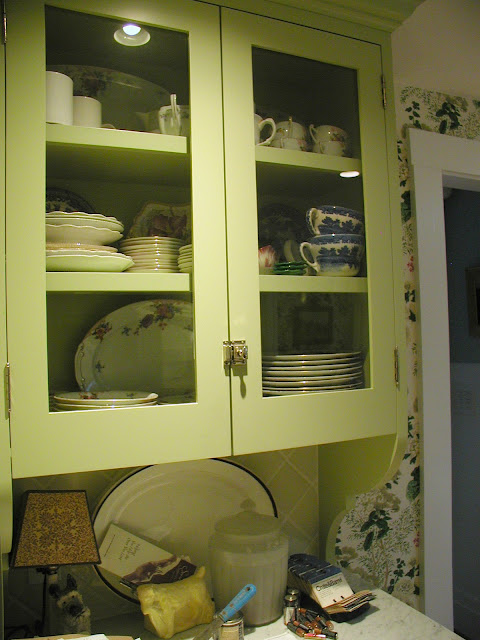
I like glass doors on kitchen cabinets because it lets me see more of my STUFF!!! In Florida when I redid my kitchen (which I will post when I go down there this winter - YAYYYYY!!!! - ), my friends all complemented me on how great my glass door cabinets looked, but that they would be too afraid to do the same because their cabinets were too messy. Well, this is what I have to say to THAT!!!! All you gotta do is.......take some time to arrange how you want the stuff inside to look, and then MAKE SURE YOU PUT IT BACK THE SAME WAY AFTER YOU USE IT!!!!! There's a place for everything, and everything in its place.

I know I'm not supposed to use a flash because the picture comes out screwy, but I couldn't get a shot of the inside with the doors closed any other way.
Here's the inside................

Here is the cabinet on the right side of the frig, it's just like the one on the left, but with different STUFF!!!!  Like the way I didn't clean
up the counter top for the picture?  

                                                                                              When arranging the inside of a cabinet, I don't like to see the bare back wall, so I stand up platters or plates. This also works as a great storage solution for platters that are too deep for the depth of the upper cabinets. It also makes it look like I am a decorator!!!
Here's a shot of it with the doors open......


To close today's post, I will end with a picture of one of my more useless ideas! I no longer use wooden spoons, so have absolutely no reason to be storing these this way, but then I wouldn't be able to show how clever I am repurposing this pipe rack.

I figure one more post, and I'll be finished with my family room/kitchen, and then I'll move on to the next room in my home.
P.S. UPS delivered my kitchen light today, and it looks better than the pictures. I am so psyched!!, now I just have to hang it without electocuting myself. (I know, I know, turn off the breaker.... sheesh.)

Friday, October 28, 2011

I have no self control

I HAVE NO SELF CONTROL!!!!!!!!!!!!!!!!!!!!
I figure this is all Amy's fault from Maison Decor, since she is always changing her house, and thinks I'm weird because once I get something the way I like it I NEVER change it. I was looking for a light for my friend Kris's bed room..........
aaaannnnddddd found this one on eBay

It's shot on the diagonal, so don't be confused and think that it is a tilted table lamp. It is a hanging ceiling light, and I LOVE IT. It holds three light bulbs, and will give a soft romantic light, which a middle aged vixen needs in her boudoir. (Not that she's middle aged, really.......well, she ain't exactly young, but she's DEFINITLY not old, which makes her....gulp....sort of....middle aged.)
Anyhooo...so, I was tooling around this sellers site which had LOTS of great tempting stuff (Ebay seller:  richardshorse), and lo and behold!!!! I SEE IT, IT BECKONEDS TO ME, I MUST HAVE IT!!!!


This is the light I have now............


As you can see, it is from the same time period, and they both have candlewick detailing (the small glass balls around the edge), but the new one is THE BOMB!!!!!
Here it it is lit up.......

I know I'm making a three course meal out of a snack, but here is the detail of the stem....

So, now I will wait for it to arrive, the seller is GREAT and already shipped both Kris and my lights out. (Is that grammatically correct? My father would say that was redundant. OK, it should probably read..."shipped both Kris's and my lights.", but that doesn't sound good either, well you get my meaning and I don't think he reads this anyway.) (The man is 96, and nothing gets by him.)

Monday, October 24, 2011

More posts on my kitchen remodel

Sooooooo...... here's the view from the kitchen into the family room when I bought my condo.......

The cabinets do a really nice job of blocking light from the family room. Don't you love the wallpaper with the black Formica and the parquet flooring? not to mention the dog food color of the counter tops!!  It's amazing to realize that someone had to actually voluntarily choose these materials, that they actually thought this looked good!!!!!!!!!!!!!!!
I removed the hanging wall cabinets and redid EVERYTHING else.

I found the plaid rugs at Pottery Barn for a really good price. I loved how it was an unexpected pattern and how the colors were a little bit off. I felt it really warmed up the rooms, and I used them in both spaces. Knowing that they would be discontinued, and I would never be able to find them again, I bought two for the family room and three for the kitchen. Now when I have them cleaned, I switch out the extra rug for the dirty one and store the newly cleaned one when it comes home from the cleaners. These rugs were so cheap, that it costs more to clean them then the rugs cost new.
The kitchen is barely big enough for an island, but I squeezed one in anyway. If this had been for a client I never would have heard the end of how this doesn't work from a practical traffic flow point of view, but since it's for me, HAH! I love it. I WANTED AND ISLAND AND I GOT ME AN ISLAND!!!!!


I found this table at a local antique store and had my woodworker add onto the legs to lift it up to 36" high.


The table had four stretchers connecting the legs, so I had him create a shelf out of a grid work of wood.


I had a paper towel holder that I brought from my house in Watertown that I had a woodworking friend make out of antique sewing machine drawer fronts. I screwed it to the end of the table to make a great place for my towel storage.


I had found the drawers fronts years ago and bought them because the pulls were cast iron shapes of bull dog heads, and I collect dog stuff. I had them for years and years before I got the idea to make them into a paper towel holder.


I found a wonderful old green candlewick light fixture from the 30's or 40's on ebay and figured out a way to work it into my lighting plan for the kitchen.


I wanted something different for my drawer pulls. Restoration Hardware had these pulls for sale, they don't sell them anymore, probably because I was the only one who bought them.


They have real pressed flowers underneath the glass of the pull and I love the way they work with the kitchen wallpaper.

OK, my neck is killing me, sitting at this computer, so I will finish up about my kitchen in my next post. See you around!!!!!

Thursday, October 20, 2011

To continue the story of my family room/kitchen makeover.....
Here's how the view looked into the kitchen when I bought my condo.....
Isn't it lovely!!!!
Nothing makes me want to create exciting recipes like a dark light-less room. What a good idea the original builders had to use black cabinets in a space with NO windows!!!!! Black Formica!! YUM!!
So I made a few minor changes. (OK, OK, "minor changes" is not an expression in my design toolbox. How about "spent way too much money, so I had to learn how to cook to justify the expense of this room?")

I raised the beam up into the ceiling that separated the family room from the kitchen, thus opening the inner space up to the extra light of the family room. Then I added some detailing to the side wing walls to make them look like wooden columns.

I designed wooden cabinets and had my cabinet builder build them to my drawings. I am a snob when it comes to cabinet doors, and am only happy if the bottom rail (the wooden piece across the bottom of the door frame) is wider than the top rail of the door. I chose a green color paint that did not exactly match the green of the wallpaper because when things match too perfectly, it looks too "set" to me. The wallpaper is my FAVORITE of all time, and has been DISCONTINUED!!!  by Lee Jofa. I don't know what it is with you kids today, but how come no one seems to like the old fashioned floral stuff anymore???????
I originally thought I would install a rod over the stove in order to hang pots or utensils, but decided I wanted something more decorative and found this wonderful tole tray on ebay.


This is how it looked without the tray.....


This is with the tray...


Even after all the years I've been decorating, I still get a thrill out of how one item can change the whole feel of a space.

I'll show more on my next posting, but I've been sitting long enough at this infernal machine and I need to go outside and get some fresh air.
Till next time.......

Saturday, October 15, 2011

Stripping for a cause

Amy from Maison Decor asked what was going on with the walls in Miriam's dining room. Well, now I understand the true heartache of OCD. If you've been following this, I suggested Miriam strip the paint off the corner cupboard before she painted the wood work in the dining room because the old paint was gloppy and peeling off. She just needed to get if down to a stable tight layer of old paint, so the new paint wouldn't peel off with the old paint. I know she's been working really hard on this, but today I had her email me some progress pictures, and now I know why it's been taking so long. She is stripping it completely of all paint. OY!!! THIS IS NOT NECESSARY!!!!! I want to get this room done before I die of old age.

So I suggested she wash it down with mineral spirits and steel wool, and work any glop out of crevices with a scraper or razor blade, then sand the whole thing lightly with a fine sand paper to take care of the raised grain that is NOW EXPOSED because she stripped it down to bare wood.
All this is in answer to Amy's question of when I was going to put the fabric on the walls. WELL I CAN'T UNTIL THE WOOD WORK IS PAINTED!!!!!
P.S. It is NOT necessary to strip the back wall (which is plaster) of any paint. I know, I know, when I first did DYI I didn't have a clue either, but that was SO LONG AGO, that it's hard to remember.

Friday, October 14, 2011

Chairs for Miriam

For those of you following this blog, (which is probably all of you, otherwise, what are you doing reading this?), this is yet another installment of Miriam's Dining Room. We've been searching high and low for interesting dining chairs, meaning that we've been looking on Craig's List and ebay. Yesterday we snagged some in a local auction that we (I) are very excited about. Miriam really wanted them to all be arm chairs, because when she and Ross come to dinner at my house, she likes the way everyone lingers around the table after dinner. Well, all my dining chairs are arm chairs. They are 3 different pairs of chairs, as I like to mix things up, and they are all comfortable. But with a very small budget, she couldn't afford one's like Aunt Betsy has, so we were REALLY LUCKY to grab these.

They look GREAT in the photo. PHOTOS LIE!!!!!
They all have to be reglued (I have glue and clamps), the finish is HORRIBLE (we are going to paint them, anyway), and they are some of the most UNCOMFORTABLE chairs I have ever sat in.
BUT, I am going to reupholster the seats, and add a lot more padding and make big toss pillows for the backs to fix the way the back bar hits just in the wrong place. I couldn't believe that someone was bidding against me on these horrors, and I figured it was someone who saw them online, and hadn't seen them in real life. At this auction house people can bid over the internet, and it only takes one other person to push the price of an item up. I was hoping to get all 8 for $50.00, but we (Miriam) had to pay a little more than that. We still managed to hit her budget, and I have promised to redo these when I come back up north from Florida in the spring.

Tuesday, October 11, 2011

Family room continued

Some of my favorite possessions are items that I got for clients and that they didn't like. I brought this painting to a client in Boston's back bay, thinking it would be a real plus to the look of their living room, but they couldn't see beyond the ugly frame, (I also think that they couldn't appreciate a painting unless it was an artist that they had heard of, or a very expensive piece of work. I should have put a higher price on it.)


This is my favorite painting that I own. I thought I would get a frame that was better suited to the piece, but when I took it out of the frame, I really liked it just by itself. 


Of course, I can't have a bare area on a wall, without adding plates. My father thinks they detract from the artwork, but I think it's just cozier.
The plates are from my collection of Wannopee lettuce leaf pottery.
Majolica green Lettuce Pottery was made by the New Milford Majolica Co. organized in 1887. The company changed the name to WANNOPEE in 1892. The most famous design was the "lettuce leaf" and had a series of different manufacturing marks over the years. The company was liquidated in 1904. I love this pattern so much that I have some of it on the walls of my Florida home too.


There are a lot of advantages to living in a condo, but one of the disadvantages is a conformity of exterior design. Of course, this is not a disadvantage when dealing with my neighbors, but is a disadvantage when I CAN'T DO WHAT I WANT TO DO!!!
The casement windows don't have muntins (what most people call mullions), you know, the wooden grills that divide the window into a grid. I don't like the look of just one big piece of glass, to me it's not cozy (there I go with that word again). So I figured NO ONE WOULD SEE THE BACK OF MY UNIT, 'cuz it's hidden by bushes and trees. Sooooooo, I bought snap in grids for the back of my house, hoping I wouldn't get caught. (I know, I know, now it's on the Internet, but don't worry, I WAS CAUGHT).

Here's the way it looked without grids.


I don't feel that this looks cozy, so I found out that Pella (the makers of my windows), and Anderson (the maker of my sliding doors) sells snap in grills. Boy was I excited. I wanted to run around my condo complex and share the good news, only I would get into trouble. I tell ya, it's hard for me to keep my mouth closed, so of course the info did leak out.

Here it what it looked like after I committed my act of rebellion.


That's all for now, I still have a lot more to say about this space. Oy, can I go on or what?
Stay tuned.

Monday, October 10, 2011

Family room/kitchen renovation

I wanted to create a room to which I would gravitate.

before                                                                  
I wanted to create a room full of sun and air.
The room felt closed in and claustrophobic to me, but I was too close to it emotionally, so I didn't see any obvious solutions. I went into designer mode, and just did to it what I would have done if it was for a client, which is rip the @#$ out of it. Since there was no construction over it, I wondered "what in the world is ABOVE this space???? I don't see nothin'!!!! Then I'm going to rip it open!!!
I love crow bars!!! They are a designer's best friend. The room had a really nice roof line; which made a great ceiling profile. It also provided another surface to cut into for windows. So I had three skylights added.
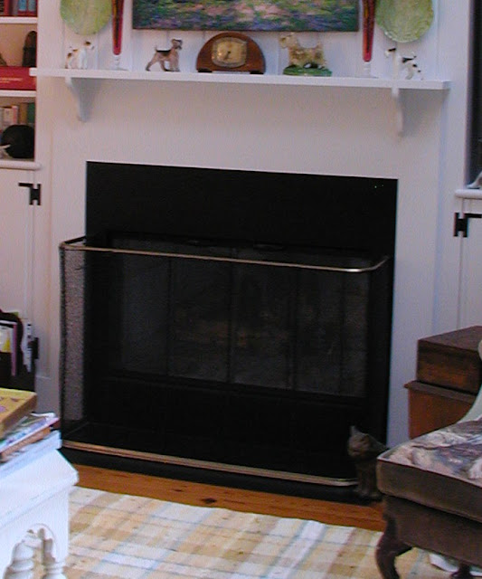
Since the fireplace was a metal box, and not masonry, I was able to move it around (sort of). I had always wanted a fireplace with bookshelves on either side ( I grew up in a house with them). I was renovating this house just when thin TVs were coming on the market, so I was really excited about placing one in a bookshelf only 10" deep. I had the wall built forward 10", and pulled the fireplace forward, placing recessed bookshelves on either side, redesigning the look of the wall by using mat black slate as the fireplace surround and hearth and cladding the wall in V-groove paneling.

I covered the ceiling with bead board for a total country feel, becoming deadened to the increasing bills the contractor was handing me.
One of the aspects of the room that made me feel closed in was the height of the window sill. It was 34" high. I am used to a 30" high sill, it doesn't cut your site line to the outside as much, making a room feel more open. So, since the windows were old, and would have to be replaced in the near future, and I wanted to get all the construction over before I moved into my new home, while I was replacing the windows, I lengthened them by 4", to have a lower sill line. It transformed the space (for me) (and that's all that counts, since I don't see anyone else living here).

I'm going to end this here, I will try to finish tomorrow, but as you can see, I hadn't posted in a week, and I was getting yelled at (you know who you are), So I figured I better get something up before I loose the few followers I have.

Linking to:  wow us wednesdays

                  Mod Mix Monday

Tuesday, October 4, 2011

Creating a new home

Seven years ago I moved from my home in Watertown Ma. to a townhouse condo in a western Massachusetts suburb. I had loved my little cape with its architectural detailing from the 1930's, and moving into a 1981 condo with 1980 crappy detailing was not something I was willing to take lying down. So I pulled out my checkbook and TOTALLY over-corrected the problem.

This was the family room/kitchen area I bought before I threw a contractor at it.
 View of the fireplace wall (duh).


View out to the terrace.


                                       This is the view into the kitchen. Do you like the black cabinets hanging down between the two rooms? This is a really good design idea if you want a room to feel like a dark cave. The kitchen has no windows, so all the light comes from the family room.
Here's the view into the family room from the kitchen. The parquet flooring was worn and cheap looking, and the cabinet arrangement was just downright bizarre, with a peninsula sticking into the room to make some kind of a snack bar.

Over the next few days, I will show the pictures of the progress of decorating in both the family room and kitchen, but I am too tired now to do it. So this is another teaser post. I realize, I am not a very nice person. I also realize I am lazy.
OK, OK, I'll post one picture.

I opened up the ceiling for a cathedral, and added sky lights. I did a lot of other stuff that I'll tell you about later. So COME BACK!!
Related Posts Plugin for WordPress, Blogger...