That's right little campers.....
I'm back for another post
right on the heels of my previous one!!!!!
You guys are so lucky.
Or, as they say in New Jersey,
Yous Guys.
Seee?
I learned something from my under graduate degree.
After writing that I was definitely going to use the green colorway of my cabbage rose pattern.
I have changed my mind.
Again.
Quelle Surprisio!!!!!
(spell check doesn't like it when I make up new foreign languages.....)
(spell check has no sense of humor.....)
You may wonder why there are two blog posts in close succession...
WELL...
I have a headache.
And my headache medication has caffeine in it.
I don't normally have caffeine.
Due to medical issues that are none of your damn business.
(Not that you would be interested, 'cuz my family is certainly bored hearing about them, and they are all doctors.)
SOOOOOOO.......
when I have a headache, it is a great excuse to get a little caffeine in my system.
Which my brain box really really really really loves.
AND.......
I am having trouble working out a drop repeat right now on a new design, so I am looking for any excuse to distract me from my frustration.
So,
let's get to today's design issue for little Betsy.
We left off here.
I was going to use my green colorway.
I really love this look.
It is fresh and pretty....(if I do say so myself.....)
however....
there was an uproar from the peanut gallery pushing the pink color back to the forefront
of my cerebellum.
You guys liked it in the room, and pointed out that it was more what I was known for.
Not that you shouldn't allow me to evolve.
sheesh.
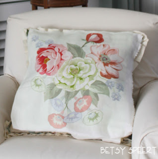
So I placed the pink on my antique French chair to show the class how it looks, because that is how I will be using it.
Like the way all my pictures are blurry?????
I am too lazy to pull out my tripod, and I am shooting in low light.
So deal with it.
I gots to admit that this colorway goes better with the rug and bookcase.
Maybe that's because I originally designed it to go with my living room.
It was so long ago that I forgot that.
Can you believe me?
Talk about a senior moment.
I expressly colored blue flowers into the bouquet to pull in the blue of the bookcase.
I worked really hard for this $%# colorway to work with my living room, and then I forgot that I did that.
Below is the way we sell it in my collection.
It is a fresher pallet.
Josh chose the more muted one that I show above to be printed on my natural linen ground.
Here is one of my fabulous side by sides!!!!!
See how the one on the right is more muted?
That's the one for me.
Below I've pinned the two samples to my current drapery panels, you can see the difference even better.
Sooooooo.....
the one on the right is the bright way it's being sold, and the one on the left is the way I will use it, and it's not for sale, unless you want it, and then, of course we can accommodate you!!!
AND THEN!!!!!
BECAUSE I'M AN IDIOT!!!!!
I had to try another colorway.
This is the French blue on white.
I am not going to do it.
But I am leaving no stone unturned.
I need another caffeine pill.
Or something.
ANYTHING.
please.
on that note,
Latah Gatah


.jpg)
.jpg)
.jpg)


