
Today I'll finish up with the main house that I did for Wynn and Catherine Newhouse on Martha's Vineyard.
Next week we'll go look at the guest house.
If you've been following this story,
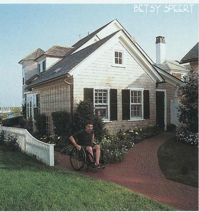
you may remember that this house had barrier free design,
what some may call universal design,
due to the fact that Wynn used a wheel chair.
So when it came to designing the master bedroom, I had to take that into account when choosing a bed.
It had to be the right height so that he could transfer onto and off of the bed into his wheel chair.
We found a beautiful one that was waxed pine from Spain, but the standard mattress height would have been way too far off the ground.
Wynn and I spent some time figuring out what he liked best.
The advantage of designing for a specific disabled person, is that you can tailor the furniture and fixtures to him.
The furniture factory was willing to accommodate my custom dimensions, but of course it took longer to get the bed.
This was in the days that waxed pine was all the rage and everything that had been painted was stripped and waxed.
How funny that now we are stripping off all the wax and slapping on new paint.....

I had to work on Catherine to get her to approve the wallpaper.
She was worried it would be too busy.
I thought it would make a pretty soft cocoon, counteracting the cathedral ceiling, which can sometimes make a room feel less than cozy.
This house may have been the first time I ever used sheers as the primary draperies on a window.
Remember, this was a gazillion years ago, and up until then I had only seen them as a secondary treatment to leave closed over the window all the time.
Since then, I have used them
EVERYWHERE!!!!!
The painting over the bed was one that the Newhouses chose in a local gallery.
It's so annoying when the clients have minds of their own.......
I would have reframed it in a more traditional frame.....
In the master bath, I designed a sink that allowed Wynn to roll under the counter.
I drew funky looking brackets that a local woodworker made.
We found an antique Victorian curved top mirror that fit the space, and I had it painted white.
The towel bars had to be all at a low height, so Wynn could reach them.
The shower was a roll in stall where he could transfer onto the seat inside.
I continued the master bedroom wallpaper into the bathroom.
This is something I always try to do to unite a master suite, even though this bathroom wasn't attached to the master bedroom, but off the hallway as this was an old house.

I stole some more pictures from Vignette Design , a wonderful blog that wrote about the way this house house looks today with new owners.
It sometimes is for rent, and Delores from Vignette Design stayed there with no idea that I was the original designer.
Boy, what a small world!
Below is a picture of the bathroom in it's current life.
The mirror was kept, but the scones changed and they were able to add a long vanity that looks like it's from Restoration Hardware.
Upon closer inspection by moi.....
I see that the floors been changed to what looks like 12 inch carrara marble tiles.
I use small tiles in a bathroom due to the danger of slipping on a wet floor.
The advantage of a small tile is that the grout lines will interrupt your slide.
They used a trick that I have employed in bathrooms when the vanity extends under a window so there is no way to have a mirror over the second sink.
A shaving mirror on a swing arm is a fun way to fix that problem.

Les Brown, the architect that I forced to work included in this project, worked with the landscape architect and the builder to devise the brick paths that were actually ramps for Wynn to access the house with no steps or thresholds to deal with.
Wynn used a super light wheel chair, and none of us could ever keep up with him.
I chose white outdoor wicker chairs with a little table for the porch overlooking the harbor.
Wynn and Catherine loved to see the activity in the water as both of them were avid boaters.

Below is a shot of the porch today.
They still have the same chairs and table but have refreshed everything with new cushions and pillows.

In Delores's shots of the house now, it's fun to see what is still being used that was purchased so long ago.
They kept the boat figurehead that we had hung in the front hall.
Below is a shot of my work.

And here is how it looks today.
The seat cushion has remained with the figurehead.
The sconces have changed as well as the window treatments to a more contemporary split bamboo roman shade.

Below is my work in the dining room. The walls were painted a simple blue as a backdrop for the toile plates we collected.

This is how it looks today.
It has a more current look with a seagrass rug ad bamboo Chippendale chairs that have a more mid-century vibe.
They did keep the dining table and added it's leaf.
I love the blue and white wallpaper that looks so crisp next to the white woodwork.
Instead of my patterned curtains, they have a simple white with a contrasting blue tape on the edge.
The tole sconces have been swapped for polished nickel.

I wonder if they kept the white oak server???????

In this picture there's no way to tell......

So that's if for this part of the tour.....
next week...(or the week after.....) we will look at what I did to the little house behind this one that used to be a garage.
Have a good week,
I now have to fold my laundry as it's Sunday and LAUNDRY DAY!!!!!
on that note,
Latah, Gatah
 |


.jpg)
.jpg)
.jpg)


7 comments:
Oh wow, what a fabulous place. I love your work, always amazing.
I love this home. I have gleaned so many wonderful ideas to use in remodeling.
The Bathroom: Using small tiles to avoid slipping. The installation of the sink. I have never liked pedestal sinks because there is no place to set things down. The brackets give the sense of a pedestal but with lots of room. The cohesion from continuing the wallpaper from the master into the bathroom
The ramps into the house with no thresholds. Coping with class. It would be so nice to incorporate that into an ordinary home.
I am enjoying this tour so much.
I loved this beautiful home when the article was first published. I am so glad that now Universal Design and Aging in Place are concepts for everyone. Homes should work for the entire family. I think your work is brilliant. Pam B.
Lovely house and honestly, I like the way you designed it better.
Julie, I agree with you. I'd have Betsy work her magic on my house any day!
Beautiful, elegant and heartwarming!
I loved this house when I first saw it, so bright and cheerful.What you did with that house, Betsy, was something out of a dream. The eating area of the kitchen invited you to come sit down and have coffee and a nice chat. Now, it looks like something out of an anonymous restaurant. It could be anyone's eating area, with the non-descript pillows and cushion fabrics. All the life has been ripped out of it and replaced by lifeless zombie accents, IMHO.
Post a Comment