WELL!!!!!
We accomplished my goal!!!!!
After I wrote the post on Connie and Chris's kitchen....
showing how beautiful everything was looking except for the chandelier that was chosen....
before we had established the direction we wanted to go in the decorating....
Connie realized the chandelier had to be changed.
So we went to work on Chris......
AND HE CAVED AGREED WITH US!!!!
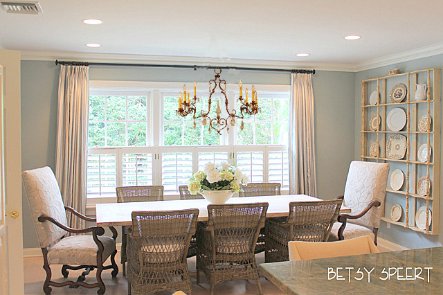
Here's the picture of the kitchen with it's current chandelier.
Sooooooo.......
I turned to 1st Dibbs and spent the next 10 years few hours of my life looking at a ton of chandeliers.
I found several that I had Connie check out.
The first one was a good possibility,
but the finish was very chipped, and not in a way that would work with the room.
The next option was a crystal and wood one that we both thought was very pretty.
Then I found a stunning one that was whimsical and charming and intriguing and pretty and
WAY TOO EXPENSIVE!!!!!
So I then tried for a simple iron one, but it didn't work with the blues of the room.
Sooooooo.....
continuing in the iron category, I found this baby, but it was too long for an 8 foot high ceiling.
Even if we took out the linked chain in the middle.
Well.....I didn't give up and found this one that was interesting and charming, but the scale was too large.....
FINALLY....
I found this one that was long so it would work over a rectangular table, but not too
tall so it would fit in a room with 8 foot ceilings.
It is gilded iron and we will change the crystals to a more sophisticated look.
I'm not a fan of faceted crystals.
I like rock crystals, 'cause they rock!!!!
THEN!!!!!
In my Betsy brilliance.....
I thought of photoshopping them into the picture of Connie's kitchen, so that we could be sure we liked the look of what we chose.
First I had to get rid of the iron chandelier.
Not a great Photoshop job, but then I'm not getting paid.....
Next I tried to add the first one.
Not bad, but it looked too predictable and I wanted something a little less ordinary.
So we tried the crystal one. It was very pretty, but it sort of disappeared.
It didn't make a strong enough impression.
The one below is the one I fell in love with, before I looked at the price tag......
Connie was the one to point out how much it was.....
It's not my money, so I don't care!!!!!
You have to suffer for design!!!!!
This one (below) was too large, I Photoshopped it in smaller than it actually is.....
I think.
It's pretty cool looking.
But too big.
Then I tried this one, it was just too much mass.
But pretty!!!!!
Connie wanted something with a lighter feel.
Soooooo.....
this next one was perfect!!!!!
I am going to find old crystals like this.....
And redazzle the chandelier a la Betsy.
Soooo....
Here's another stunning side by side comparison for your viewing pleasure.
I might hang it a little lower.....
I'll have to see when I get back down to Flerida.
It might be a little larger than I have it shown.
Or a little smaller. (I hope not....)
So
on that note,
Latah, Gatah


.jpg)
.jpg)
.jpg)


10 comments:
This chandelier looks marvelous!
I like the new chandy so much better!
Big Texas Hugs,
Susan and Bentley
Yay, glad it was changed, I was kind of wondering why you let the candle chandelier stay up! It didn't look like your taste.
This new one is elegant and lovely over the table.
Mary from Virginia
Betsy, you are just too clever! When I was choosing my fixtures I just closed my eyes and tried to wish the image. But this made the decision obvious.
Penelope Tucker
Oh wow so glad you decided to change the chandy, the new one you chose is so much prettier then the current one.....
Way to go Betsy.....
You nailed it... again!!!
LOVE the new chandelier...so unusual and elegant...but I must comment on the dining chairs (please don't kill me)...I love all the chairs, it's just that I keep thinking every time I see a picture that the scale of the side chairs is off - too small - compared to the host chairs. OK, running for cover now. :)
The new chandie is perfect, nice scale, not too heavy. The first one you showed was downright ugly. Glad Ann spoke up about the side chairs.....not my taste for that table and they have arms so can't get close to the table, very uncomfortable. I'm also running for cover.......
Betsy- the chandelier is perfect 'eye candy' for the room; love the contrast with the wicker chairs and heavy furniture
I tried finding these unfaceted crystals on ebay- but no luck. Do they have a name? I like that they aren't soo dramatic as the faceted crystals, and they would be a better choice for my old kitchen chandelier as well.
Thanks so much.
Love the casual elegance of this dining room. Great choice in chandelier. Enjoy your week.
Post a Comment