Thursday, July 30, 2015

How to Keep a Sea of White From Being Bland

Soooooooooooooo.........
Let me now show you guys the rest of Connie's living room as we work our way through the many problems of decorating a white room.
As you may know, if you've been following my work for the past few millennia.....
I don't usually use a lot of white in my designs.  
So, when I do, since it's not my usual pallet, I explore a room with less familiarity than my usual attack.
Connie and I wanted this room to have a lot of personality, this way we would use the white as a foil for wonderful pieces that we picked up in our explorations of antique emporiums all the way down to true junk stores.
We started with an antique pair of metal flamingos, as we can't seem to tear ourselves away from their wonderful shape.
In Connie's previous Florida home, we had them everywhere in her living room.
But in that house they were more of the 1940's and 50's junk store variety.
These babies are a different category of object d'art. 
They aren't exactly level.....
so they need a trip to the welding doctor to straighten them out.
This will happen this fall when nurse Betsy is back in town.
They form a nice vertical division in the middle of the space.
Now, if we could only find some artwork.......
luckily.....
we did, 
and I will show you guys in the next post, 
maybe.
We needed new coffee tables, as the one Connie had from her last house was too primitive for this one.
It's the wooden one shown in the picture below.
We needed something that would work with the Gustavian pieces we had chosen for this room.
I found this one from Niermann Weeks at the M-Geough showroom in the Boston Design Center
I chose a black rusty finish, a I wanted it to have a somewhat garden table vibe.
I don't know why, it just seemed the right direction to go because of another piece in the room, which I will show you guys in
another upcoming post!!!!!
I love the way it works with the Louis XVI game table.
Now we just have to figure out what to put on it.
Connie has a large garden trough from her last house on it.
it's not going to stay there!!!!!
right Connie?????
The big block of white that the bookshelves created bugged me.
I suggested
 (gently to Connie.....I think a sledge hammer may have been involved.....)
that the inside of the bookshelves would look better if they were painted to match the blue of the walls.
She wasn't sure she wanted to.
She isn't as afraid of my sledge hammer as she used to be.
But she caved to my whining, and had them painted.
I think it made a massive difference.
Here's the side by side.
When I get my way.....
it's very exciting!!!!!
On that note.
Latah, Gatah

Photobucket

Wednesday, July 22, 2015

Simplifying Architectural Details in Connie's Living Room

When Connie and Chris bought their new Florida home, the architectural details in the living room were too ornate for our taste.
The bookcase had fluted Corinthian columns with ornate acanthus leaf capitals.
Here's a better shot that I took,
 the above one Connie took with a lower pixel camera.
This is a Corinthian Column, with acanthus leaf capitals,
 which I actually told you in the previous paragraph, but I am loosing my tiny mind.....
It had a fluted pilaster with an aged wax finish that just looked cheap to me.
I'm more of a Doric Column kind of a girl.....
A Doric Column looks like this
HOWEVER.....
I didn't want a column look at all, so I compromised with the bookshelf and had a local carpenter pull off the columns and add some simpler detailing.
I drew how I wanted them to look with a scaled drawing and cross sections to show how it should be built.
Connie left my drawings on one of the shelves,
 so the builder would have them right in front of his nose, 
 and then the guys from FLORIDUH built it the easiest way,
 ignoring my drawings.
I'm so glad I spent all that time figuring out how to do it.
At least they followed the proportions that I set out.
But instead of making the columns with recessed panels, they just applied some molding.
To spend so much time drawing an architectural detail, just to have the guy do it the easiest way
 is one of my pet peeves.
But the main thing is that Connie is happy.
It's her house, and she is fine with it.
And it still looks A LOT BETTER than it did.
The new way just works better with the style we decorated the room.
(as you will see in coming posts.......)
(do you like how blurry my picture are?????)
Next, we tackled the fireplace.
It's too was over the top with carvings, being too ornate for what we wanted to accomplish.

So, Connie had it ripped off, and a simpler one installed that mimicked the one on the other side of the wall, as this was a see through fireplace.
She didn't want a mantle shelf, as she never knows what to put on them.
I told her that shouldn't be a problem,
 because 
I ALWAYS KNOW WHAT TO PUT ON THEM!!!!!
But she wasn't convinced, and did what she wanted.....
Boy she's acting like this is her house,
 or somethin'.

Here's another side by side shot.
I'm not a big fan of applied moldings.
They definitely have their place, but I prefer carvings that are into the wood,
 not applied.
I DON'T KNOW WHY......
IT'S JUST THE WAY MY BRAIN WORKS.
I realize that I may be in the minority, but this is my blog, and this is my opinion,
 (which is the most important one in the universe....).
The woodwork in this room has had an interesting series of transformations.
The original owners, had it in a pickled wood finish.
And now we have it just white, and simplified.
I cropped the hell out of the picture below to keep from showing more of the room.
You guys will just have to wait.

On that note....
Latah, Gatah

Photobucket

Friday, July 17, 2015

More on Connie's Florida Living Room

Before I get to showing more of Connie's living room.....
Let me just tell you guys that my first pattern design in 9 colorways and scales is being shipped out to me, today or the beginning of next week!!!!!
Then Josh and I will look them over to decide if we want to tweak anything before I send the next bunch in for printing.
I am so excited and freaked out.
What if after all this time they look like shit whoops, I mean stuff you'd scrape off the bottom of your shoe?????

OK, on to Connie's Flerida home.
FYI.....she and her husband Chris have just sold their Vermont home, so some of the things we loved the most from that house may eventually show up in this one.
In particular; her mercury glass collection for the etagere in her new bedroom and a painted round mirror for over the server in her new living room.... maybe, if it looks good... and she likes it there... and I like it there.....
This is a picture of the round mirror along with some mercury glass in her Vermont home.....
Traditional Home Magazine

It may look good over the server in her living room.
We have to wait till the fall, when I go back down to sunny Floridah. 
(that's what my friend Suzy calls it, FloriDAH.)
 Connie wanted a game table in this room, as she and her hubby, Chris, play Rhummy Cube after dinner every night.
I wanted one that was more of the scale of an end table, so it would look like it was part of the seating group with the sofa facing the windows.
She and I had chosen a pair of chairs to work as the game table seating.
I ordered them in the same white fabric as the rest of the upholstery, and lightened the legs to more of a driftwood finish.
She used her old game table until I was able to find what I wanted.
See how it's size creates a separate space, it doesn't seem to be part of the seating group so much as it's own little area.
Below is a shot that Connie sent me, when she was first moving in.
This is before the room was painted and some architectural changes made.
Then Connie and I found this game table when we were antiquing at Charles Spada's wonderful showroom in the Boston Design Center.
He also shows on 1st Dibs.
It was the perfect size, being large enough for a game of cards, but small enough to be part of the sofa grouping.
It has a stained cloth inset top that we thought we might change, but have come to love.
You guys know how I love beat up stuff.
I had Connie drink the Koolade, and now she likes beat up stuff too!! 
I didn't want another piece of painted furniture, as there was already a fair amount in this house, so we lucked out with this little table.
It's a Louis XV piece, and beautiful.
OY Vey, I just noticed the movers sticker on the back right leg.
Connie, if you're reading this, please pull it off.
Thanks,
(love Betsy)
I needed something to hang over the pair of concrete colonnade tables that we had picked up at a local antique store.
I wanted something that was not a standard piece of artwork, as I didn't want the walls to be covered with paintings.
(i know, i know.....that's so not like me!!!!!)
However, Connie didn't want a lot of artwork, she wanted a simpler approach.
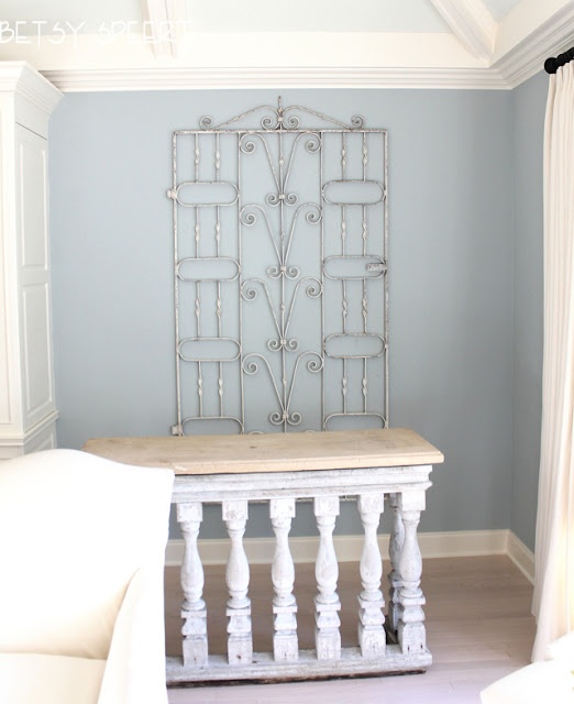
I found a pair of antique iron gates that were the right size.
I love old rusted iron.
I am a sick girl.
(OK, not so much a girl anymore.....my doctor just informed me that next year, when I'm 65, I will be elderly.....I don't think that anyone will suspect me in her homicide.....just don't tell on me.....it's just our little secret!!!!!
I told Connie not to have them hung until I got back down to Florida, as I wanted to add a little paint to lighten them.
SHE JUST NEVER WAITS FOR ME!!!!!
So, they got hung, and then Chris and Connie thought that they looked too dark.
OY VEY!!!!!
Sooooooo....
I had to paint them distressed white, while they were hanging on the walls.
I used my trusty chalk paint and dry brushed the metal, applying and wiping as I went.
Also wiping all the paint off the wall, too, as it was ALREADYHUNGANDIASKEDHERTOWAIT!!!!!

Here is the before shot, the console tables were moved out of my way. 
They weigh a ton, so we needed help getting them away from the walls.
I was very conflicted, as I sortta liked em before I started, although they WERE a little dark.
Here's a close up of my fabulous paint job.
It's very hard to paint something and keep it looking old and worn.
(Unless we'er talking about my face and makeup.....but thank goodness we'er not.....)
Here's another shot.
Another.....
Here's a side by side.
I'm still conflicted, but Connie and Chris love the lighter look, and after all.....
It is THEIR home.
After they were painted, I felt it needed something, so Connie and I are looking for something decorative, yet not to large to hang on top of them, I'll know it when I see it.
But OH BOY!!! I love looking for old crap!!!!! 
and now we have more to look for!!!!!

On that note,
Latah, Gatah
Photobucket

Saturday, July 11, 2015

A Florida Calming Living Room

AS PROMISED!!!!
I will now start showing you guys Connie and Chris's living room.
In tiny dribs and drabs....
I will try to show you guys the process we went through to finally get to the semi-finished stage we find ourselves in today.
Next fall when I return to Florida, we will hopefully add the finishing touches to make the room feel cozier.

So let's start at the point of the first furniture being delivered.
As I mentioned in a previous post, Connie realized that there was lots more room for more furniture than I had drawn on the first floorplan, so I added this server I found on 1st Dibs.
I originally drew the floorplan without it, as I wanted to be sure that Connie didn't freak out about too much stuff in the room.
I shouldn't have worried about that,
 she freaked out anyway.
She was CONVINCED that there was too much furniture in the room 
even before I had drawn in the server that's on the left wall.
For all you guys out there in blogland that don't know the rule of thumb about how much space should be left for traffic flow, it's usually 36" that 's needed in a commercial application.
WELL.....
this isn't a restaurant or store.
When a room isn't a pass through space, I can get by with just 30" of clearance.
After all, that's the standard doorway opening.
In a hallway, it's best to allow for 36", so you can move your furniture all around your house!!!!!
Since I tend to overstuff  my own home,
 I will allow for even less space because I live by myself and I have
no one to complain about barked shins.

The server I found is a Gustavian piece in a worn white painted finish.
FYI....
I got this definition from One Kings Lane.
Gustavian style hails from Sweden, but like many other styles, has its roots in the influential courts of 18th century France. Proof that imitation is the highest form of flattery, Gustavian style came about after Sweden’s Gustav III paid an extended visit to Louis XVI's court at Versailles and fell for the trim, cool-hued Neoclassical style furniture of Louis XVI style.

This is why this stuff works so well with Louis XVI style.
Sometimes it's difficult to tell the two apart.
I rely on the accent. 
If it talks French, then I figure it's Louis XVI.
If it sounds like it comes from Minnesota, than I figure it's Gustavian.

I chose it for several reasons.
It was shallow, so it wouldn't stick too far into the room, since I placed it in a traffic flow area.
It was high, I don't like all my pieces to be the same height, it creates a static feel in a room.
Different heights are much more pleasing in a space.
It was elegant, and Connie wanted to go for a less primitive style of antique than I had done for her in any of her other houses.
The color was beautiful, and would work well with the creamy feel in the room that we wanted to create.
AND LAST!!!!!
It was old and beat up, just like me!
It was delivered when Connie was still in Vermont, so her handyman received it for her and placed it in the living room.
When he called to tell her it had arrived, he informed her it was 
"old and the paint was worn off, not nice and new."
Connie assured him that we wanted it that way, and not to worry.
I think it's stunning.
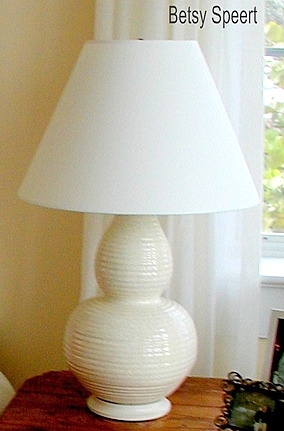
The gourd shaped lamp sitting on it is from her beach house.
It's form is wonderful because it is so stylish and works with many different kinds of decorating, being a somewhat transitional shape.
I used three of these in her beach house, all slightly different silhouettes.
One on the other side of the sofa.....
and in the guest room.....

These were such a great look that we were able to use them in Connie's new more formal home.
She just bemoans the fact that we don't have more of them.
When the girl likes something.....she really likes it.

On that note,
Latah, Gatah
Photobucket
Related Posts Plugin for WordPress, Blogger...